
補足資料
PROJECT MEMBER

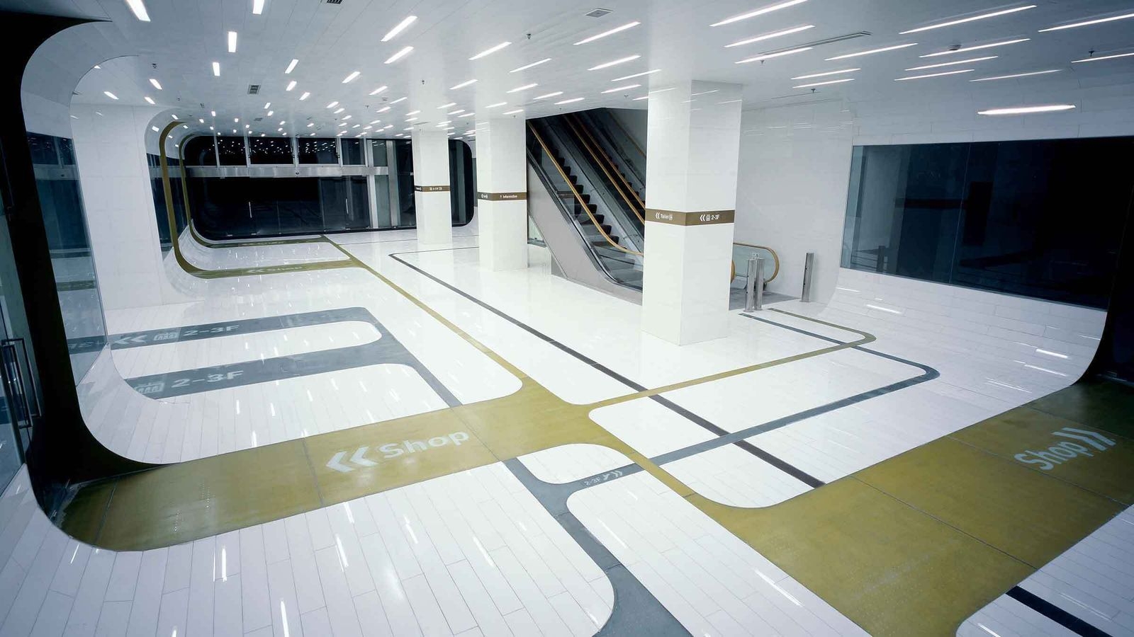
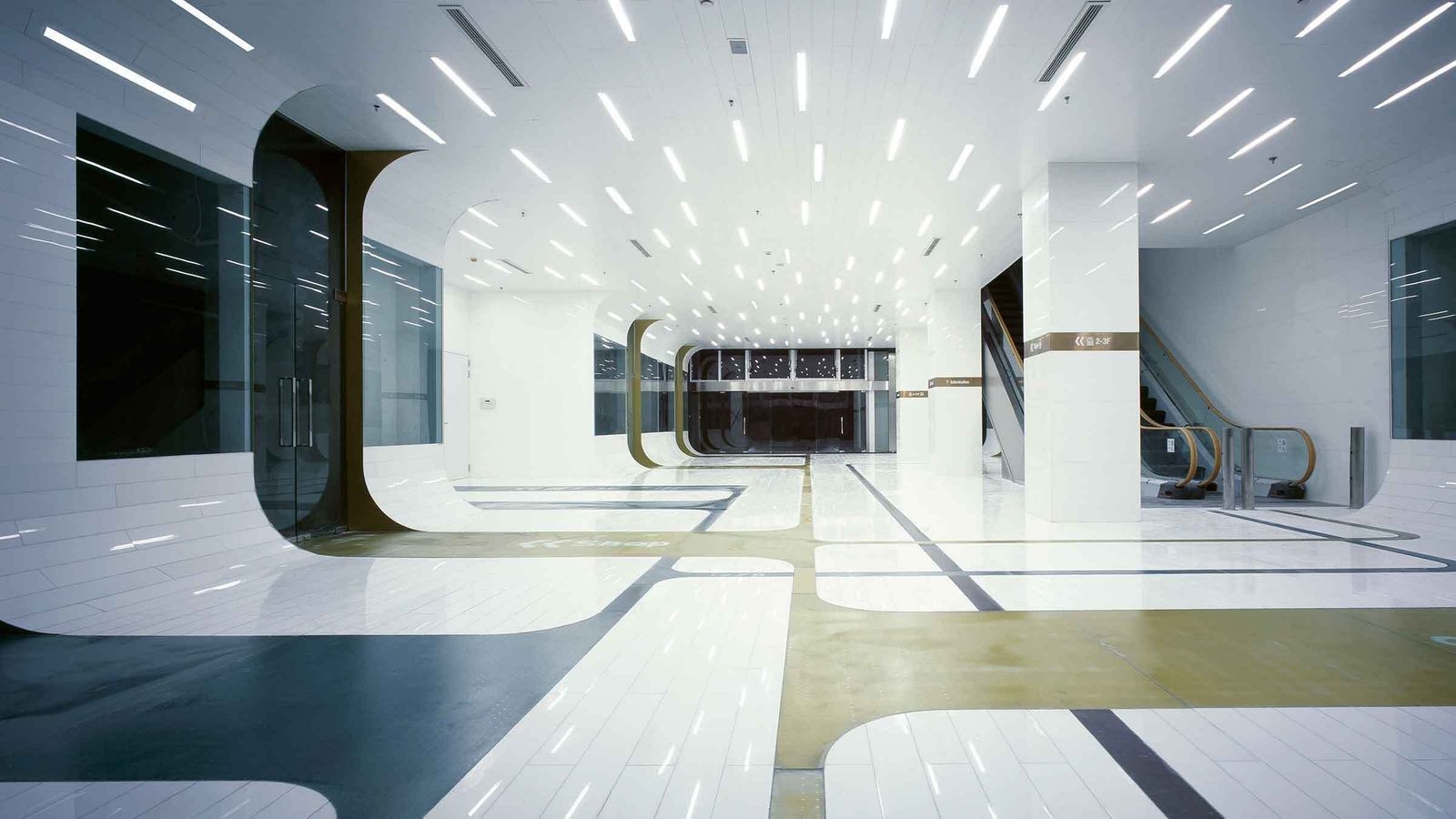
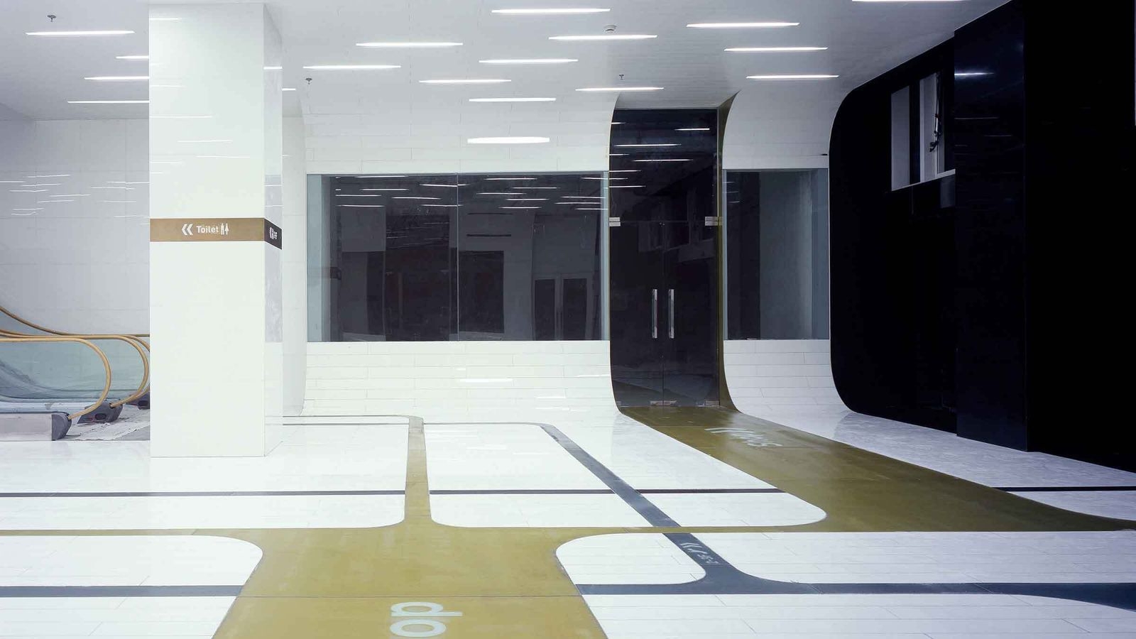
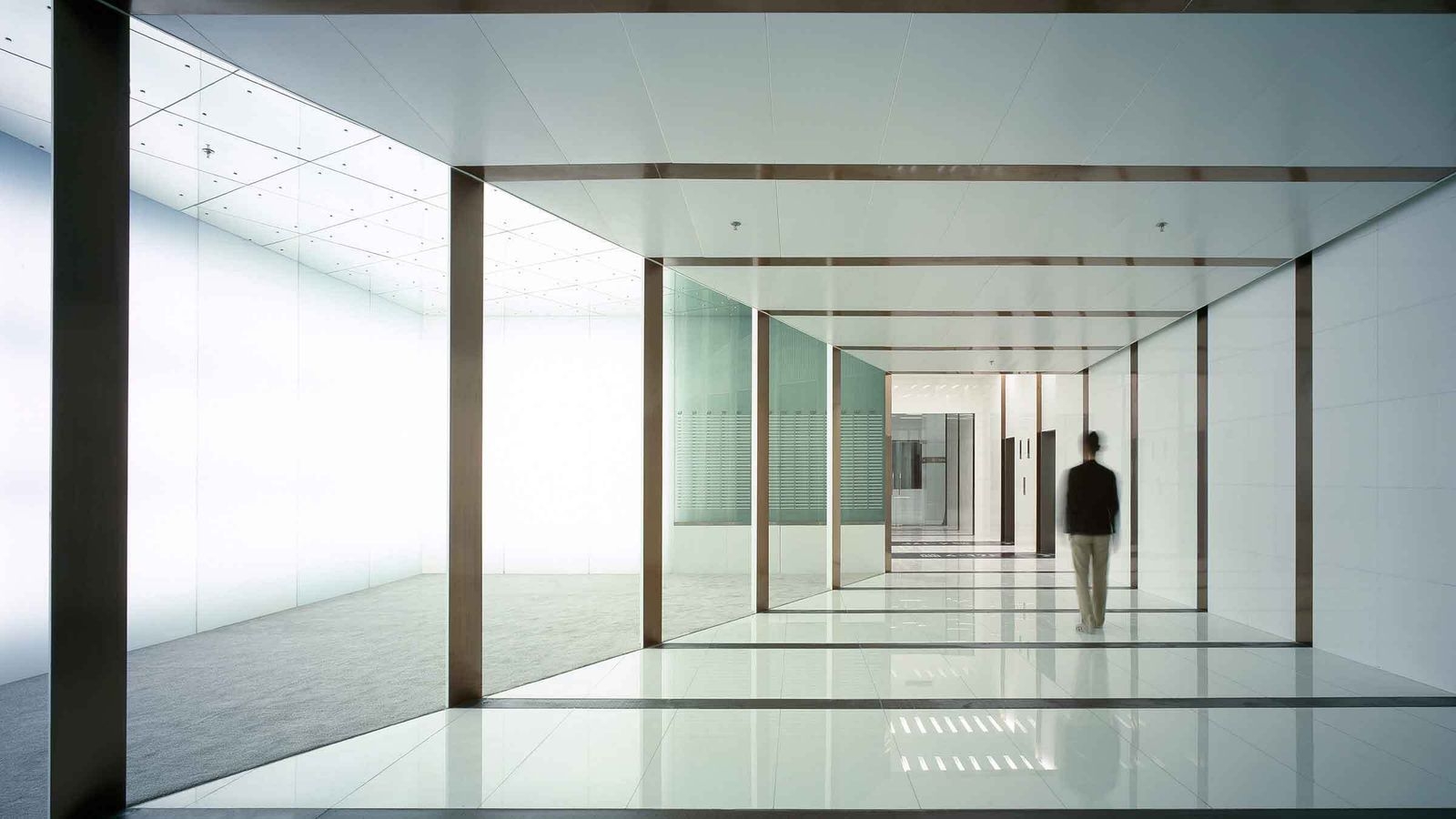
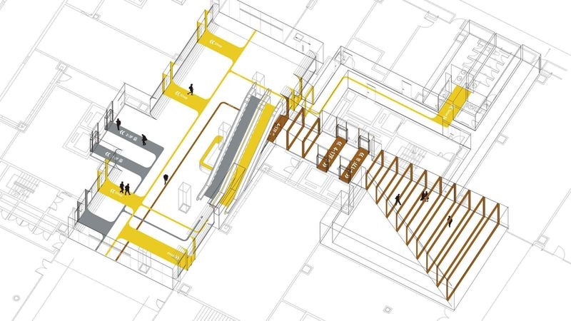
「サインで空間をつくる。空間で人をみちびく」 オフィスとSOHO、そして商業が一体になった複合施設のインテリアデザインを行なった。この施設は入口が何カ所もあったり、エレベータなどの縦動線が分散配置されていたりと、複雑な動線計画になっていました。そこで「人をみちびくサインそのもので空間をつくろう」と考えました。 ここには1階でショッピングする人、2階3階のSOHOに向かう人、そして高層階のオフィスに向かう人での、大きく3種類の人が訪れます。それぞれに金銀銅の3色を割り当て、それぞれの色が来訪者を目的地に導くよう、インテリアをつくった。つまり、これこそが「サインで空間をつくる。空間で人をみちびく」ということであり、「SIGNTERIOR」(=Signage + Interior)というプロジェクト名の由来でもある。 SIGNTERIOR = Signage + Interior. We designed the interior of a complex building integrating office, SOHO, and retail space. The flow of this building is very complex, such as many entrances, elevators and escalators dispersed throughout the building. We created the concept of “Signage creating space”. There are three types of visitors in the building: shopping on the first floor, heading to SOHO on the second and third floors, and working on the upper floors office. We assigned each of them three colors, gold, silver, and bronze, and created an interior design so that each color would lead visitors to their destination. In other words, this is what it means to “Creating space with signs, Space leading people” which is also the origin of the project name “SIGNTERIOR” (=Signage + Interior).
5